To be honest, I have no idea why many of my followers like my old Facebook template so much. I created that slide deck several years ago, and I never in a million years thought it would become the most downloaded file on my old template website. I know that social networking is very hot right now, but what are you all using that template for? I’d certainly like to know, so please contact me (or leave a comment) telling me all about it!
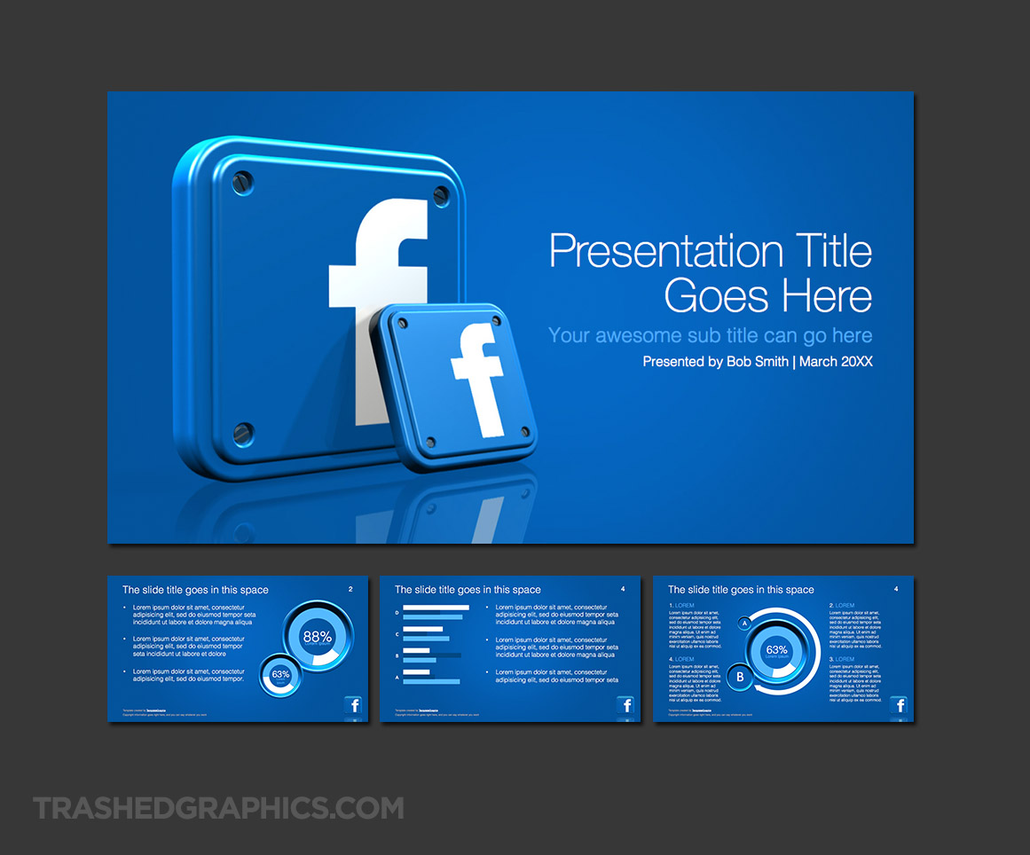
Now that I’m back to creating these presentation graphics again, I thought it would be fun to create an updated version of that old Facebook deck. I decided to use the same Facebook app icon that I used in the other one, but I spent some extra time on the charts and graphs for the interior slides. I also decided to make this a widescreen template (16:9) ratio, which will look better on many of today’s new high-resolution widescreen displays and projectors.

16:9 widescreen PowerPoint template with four screens which includes an assortment of fully editable charts and graphs
The color scheme for this one is (obviously) blue, but I chose a slightly lighter shade than the official Facebook brand color. Doing that helped to give all these pages a slightly brighter feel than they would have had with the darker blue, so it was an important tradeoff IMHO. That’s a very important part of presentation slide design – making visual tweaks here and there where necessary to make the pages easier to scan is more important that following brand colors right down to the pixel. Some may disagree, but I’ve never had someone accuse me of not following brand guidelines! Yet…
As mentioned above, the interior slides feature fully editable 3d charts and graphs. The containers for these elements were created in my 3d modeling program, but the content (numbers, data, etc) are fully editable PowerPoint elements that you can tweak however you want. Note that you don’t even have to use the 3d graphics if you prefer a cleaner look – the only reason I included them was to tie in visually with the 3d Facebook app icons on the cover slide.
Finally, as an added FREE bonus, I’m going to share with you an alternate design for the cover slide. This was the concept that I came up with first, but I didn’t like it because I thought that the Facebook icon was too small on the page. But feel free use it if you prefer it over the one included in the .ppt file!

Alternate Facebook logo presentation cover slide


No Responses Yet