Continuing right along with my social media PowerPoint template series featuring 3d app icons of popular mobile brands (I’ve already done Pinterest, Evernote, and Google +), here is one with a Snapchat theme. And you know what? I’m totally disappointed with the way it turned out!
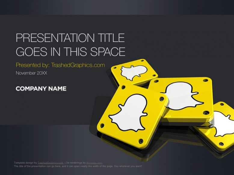
The problem is that I think that I set my expectations way too high before I even started it, and for some reason or another I was expecting one of the coolest PowerPoint templates I’ve ever built. But…that yellow! Yeah, the Snapchat yellow is a bit on the bright side and my visions of using that color as the base for this template was squashed as soon as I started laying out the design in Photoshop (I create all my template covers in Photoshop, by the way).
Yellow is a good color for a social media PowerPoint template, right?
As much as I tried to convince myself of that, my disdain for the color yellow wouldn’t let it happen. The Snapchat shade of yellow was more than overpowering and it just wasn’t going to work as the core color for this theme. Therefore, I reverted back to gray. That helped a ton! Trust me – completely yellow PowerPoint templates are annoying whether you’re a fan of the color or not.
I don’t like to dwell too much on my design failures though. As we all know, style and design are very subjective things, and the things I totally hate might be liked by others. That’s just the way it goes, so I’ve decided to publish this one anyway in hopes that there is at least one person out there who finds this useful as a general social media PowerPoint template.
Or heck – maybe you are presenting about Snapchat (and not social media in general). In that case, I think that you’re going to be hard pressed to find another Snapchat theme anywhere on the web that is as dynamic and rich as this one is. I love to create 3d logos of popular brands, and I’ve found that they look really nice integrated into slide decks such as this. I’m excited thinking of all the other types of social media PowerPoint templates I can create using this same general style!
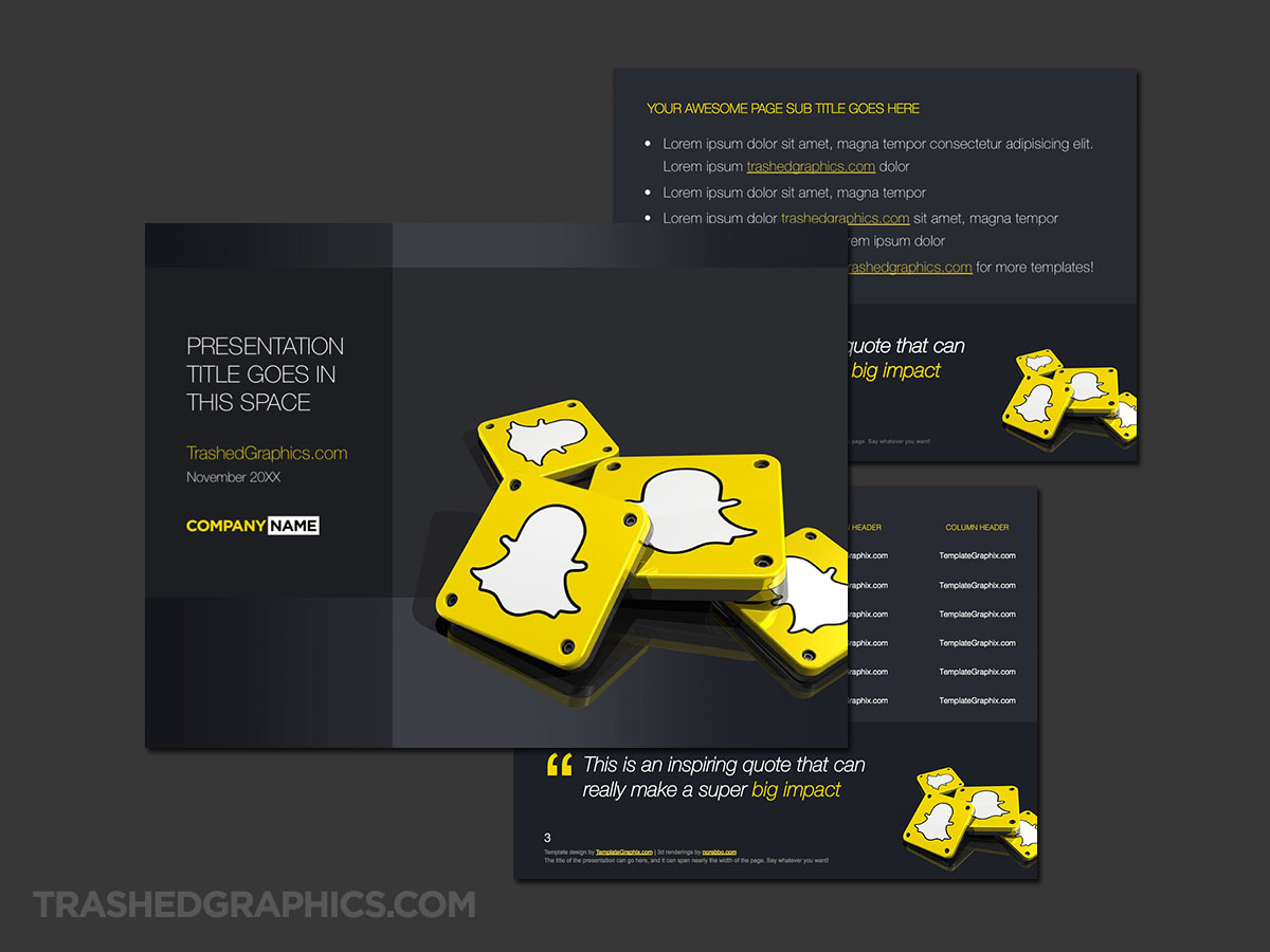
Fully editable Microsoft PowerPoint presentation template. Includes cover, text, and table pages. Yellow and gray Snapchat theme with dark colored background.
I really wished I could have found a way to incorporate the yellow into this template better, but trust me – even just small blocks of a bright color like that can be very distracting when projecting onto a large screen. I’ve made that mistake in the past with really bright colors before. Do you realize how embarrassing it is to show up to the meeting with a neon-colored PowerPoint theme that gets more attention than the content you are presenting?
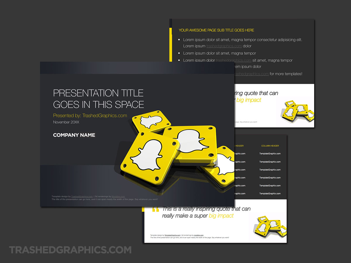
Fully editable Microsoft PowerPoint presentation template. Includes cover, text, and table pages. Yellow and gray Snapchat theme with light colored background.
There is a slight chance, however, that I’ll take another crack at this one to see if I can get it to look as vibrant (yet professional) as I imagined it to be in my head. I hate the feeling of dissatisfaction that hovers over me after a failed design attempt, so I’m pretty sure I’ll revisit this Snapchat theme to calm my nerves a bit. Eventually.
Before I get to it though, I do have a couple more social media PowerPoint templates to upload that I think you’re going to like.

No Responses Yet