One of the problems with being a visual designer who works on a lot of different types of projects is that sometimes I have to work on things that I have absolutely no idea about. Yes, that’s right ladies and gentlemen Dash I’m coming out and fully admitting that I was never better than a C student in science way back in school. However, visual design and PowerPoint templates is something that I know very well, so here are two fresh science PowerPoint templates I whipped up just this week.
One of the best kept secrets about PowerPoint template design is that it’s easy to “fake it until you make it” (so to speak). I fully admit that I would be a horrible scientist, but I do know how to create graphics that look all nerd-like and science-y. Therefore, I did have a lot of fun making these two science-themed slide decks and I suspect that they will be quite useful for many different types of scientific applications.
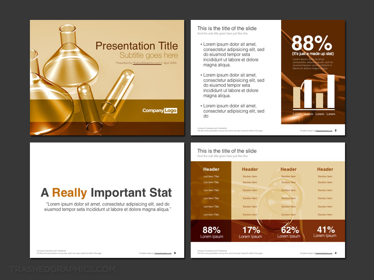
Science PowerPoint template with glass test tubes and beakers
Right off the bat, I’m suspecting that a lot of you science types rolled your eyes and held your forehead with frustration after you read that title. The truth is that I don’t really know with those stinking glass jar things are called, but we just called them “glass test tubes” way back in high school. I’m sticking with that.

Fully editable Microsoft PowerPoint presentation template. Includes cover, text, and table pages. Science theme with glass test tubes and beakers.
The color scheme of this particular template is one that I quite like actually. The brown and gold colors were mixed in a way that I haven’t done it before, and I like it so much that I will probably do it again on some other PowerPoint templates in the future. I may even create an alternate version of my brain PowerPoint template with these colors (because the current version is bright).
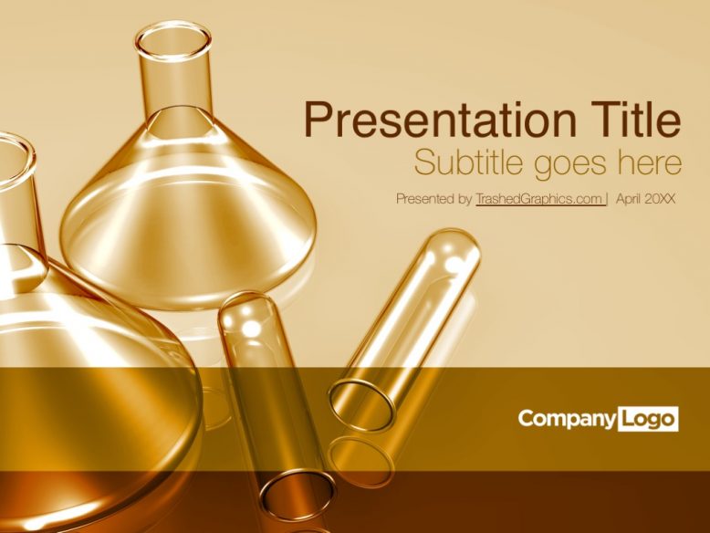
The cover slide features a random assortment of those glass test tubes and beakers behind transparent layers of gold and bronze boxes. The space for the title of your presentation is reserved for the upper right, and it’s quite a generous space as well so feel free to say as much as you need to without worry of running out of room.
The interior of this four page science PowerPoint template is varied – but extremely versatile and configurable for whatever kind of data it is you need to present. There’s a simple page for a single piece of data or a quote, which is something that I expect will be important for all types of scientific presentations. Of course there’s also a standard text slide and a highly configurable table slide as well.
As I’m sitting here writing the description for this particular slide deck, it hit me that the proper term for those glass test tube thingies might be “flasks”. Is that correct? Gosh I feel so out of my element talking about science…
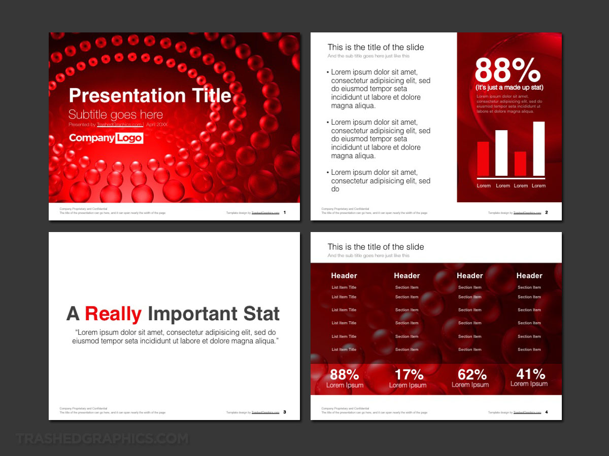
A science PowerPoint template with a bold splash of color
As much as I loved the muted gold and brown tones of my first science PowerPoint template above, I will admit that it left me feeling somewhat unsatisfied. Of course, this is in total thanks to my natural tendency to make everything I do as colorful as humanly possible.
I know – it’s a curse sometimes because not everything needs to be as colorful and vibrant as I want it to be in my mind. Being reserved is the proper thing to do sometimes, am I right? Well, I didn’t care about any of that for this next template because I went all out with the most obnoxious color possible: blood red.

Fully editable Microsoft PowerPoint presentation template. Includes cover, text, and table pages. Science theme with abstract red 3d-rendered molecules.
The cover slide features and abstract 3-D rendering of red transparent spheres arranged in concentric circles. And because I don’t know the first thing about science, I can’t even begin to tell you what my goal was for creating it. I could probably save face by saying something like it represents an abstraction of DNA molecules (or maybe even red blood cells) but the truth is that I just think it looks cool.
The interior slides were a delicate balance of trying to maintain something that looked visually appealing for a legitimate science PowerPoint template while not becoming too obnoxious to use in a professional setting. Therefore, I try to use the red sparingly as possible, trying not to overwhelm the content that needs to be presented.
Just like the first template I posted above, this one features the same style of slides.
- There’s a blank page for presenting a single bullet point (or piece of mind-blowing data), a text slide, and a table slide.
- Because I know that scientific data is extremely complex and varied, I tried to make sure that these PowerPoint templates are as customizable as possible. After all – what good are science PowerPoint templates that can’t be modified and rearranged?
One final note about this bright red science-themed template: because of how bold it is, I personally think that it’s going to work extremely well for corporations or research organizations with a lot of red in their brand colors. It’s a perfect fit in my opinion.
And by the way, if you actually do love the color red his much as I do, I’ve got a few other PowerPoint templates that take advantage of this same gloriously obnoxious color. My Pinterest theme is a really good place to start, as is my retail themes that feature large red sales tags. If those aren’t quite what you’re looking for, be sure to check out my entire archives of PowerPoint templates!
A few final words about these PowerPoint templates for science
Hopefully I’ve made it pretty darn clear by now that I’m an artist and not a scientist. Heck – don’t even attempt to give me a long division math problem to solve, because I’m pretty sure that smoke would pour out of my ears and I’d collapse within 10 seconds of trying to figure it out.
However, I am very comfortable creating rich and versatile graphics that help people present information. Because of that, my entire goal before starting these two science PowerPoint templates was to make them versatile and generic enough to not be taken so seriously.
What I mean by that is I *knew* it was important to create templates that would fit a variety of different types of applications and scientific data types. And I *knew* how important it was to avoid pretending that I knew how to present scientific data. Because I don’t. My job was to simply create an assortment of graphics that can be arranged in an unlimited number of ways by scientists of all categories all over the world.
As far as I’m concerned, scientific PowerPoint templates need to contain three things:
- They need ample space to present data. Charts, sidebars, and tables of custom content are absolutely necessary and will end up being the backbone of the template.
- The design needs to be overly simple in places so as not to compete with the data. As you can see in both of these science PowerPoint templates, I’ve tried to separate hard data areas from rich graphics.
- The design of the template itself needs to be really eye-catching. Yes, this is even important for scientists! I may be biased, but I fully believe that a stunning visual design is probably the most important PowerPoint attribute of all, because I’ve sat through enough dry data presentations in my corporate years to know that humans are far more engaged when visually stimulated. Remember though, I’m not a scientist and those are simply my observations as a visual designer…
Anyway, I hope that you found both of these science PowerPoint templates useful. As always, I’m open to suggestions, so feel free to leave a comment below if there’s something you’d like me to attempt to design next. I’m totally up for anything!


No Responses Yet