What is it with the US military and wickedly cool logos? Each branch of the US Armed Forces has a really nice logo, which is kind of an odd thing for a government agency. Anyway, earlier this week I decided to try and take advantage of that by creating an Air Force PowerPoint template. As a matter of fact, it was so fun that I ended up creating two.
It should be no surprise that I was feeling the urge to create another military-based PowerPoint team, because I had a lot of fun creating my Army PowerPoint template a few days ago. As I said in that post, the logos of our armed forces are downright stunning when modeled in 3D, and the US Air Force “bird” logo is no different.
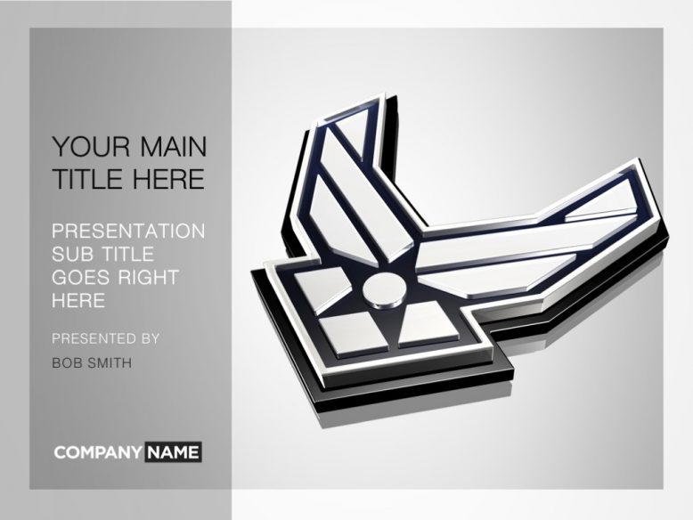
Version one of my US Air Force PowerPoint template
I’ll be completely honest with you when I say that this metallic silver and black theme wasn’t my first attempt. As a matter fact, this idea only came about after I was completed with the first version (which you’ll see if you scroll down to the bottom of this post).
After modeling the logo in 3D, I thought it would be interesting to apply high-gloss metallic finishes to it just to see how it would reflect light. Long story short, I immediately liked what I saw and decided to create an entire PowerPoint theme based around this silver and black US Air Force logo.
The cover slide features the logo prominently occupying 3/4 of the available space, reserving the other quarter for the title and presenter information. Unlike my Army template, I decided not to make the titles so prominent in this one.
That’s mostly because the official font of the US Air Force is relatively low-key and not as bold as the logo font of the US Army. Besides, I really like making the logo the most prominent element on the page – it’s a neat little trick to get the attention of your audience really quick when you kick off the presentation.
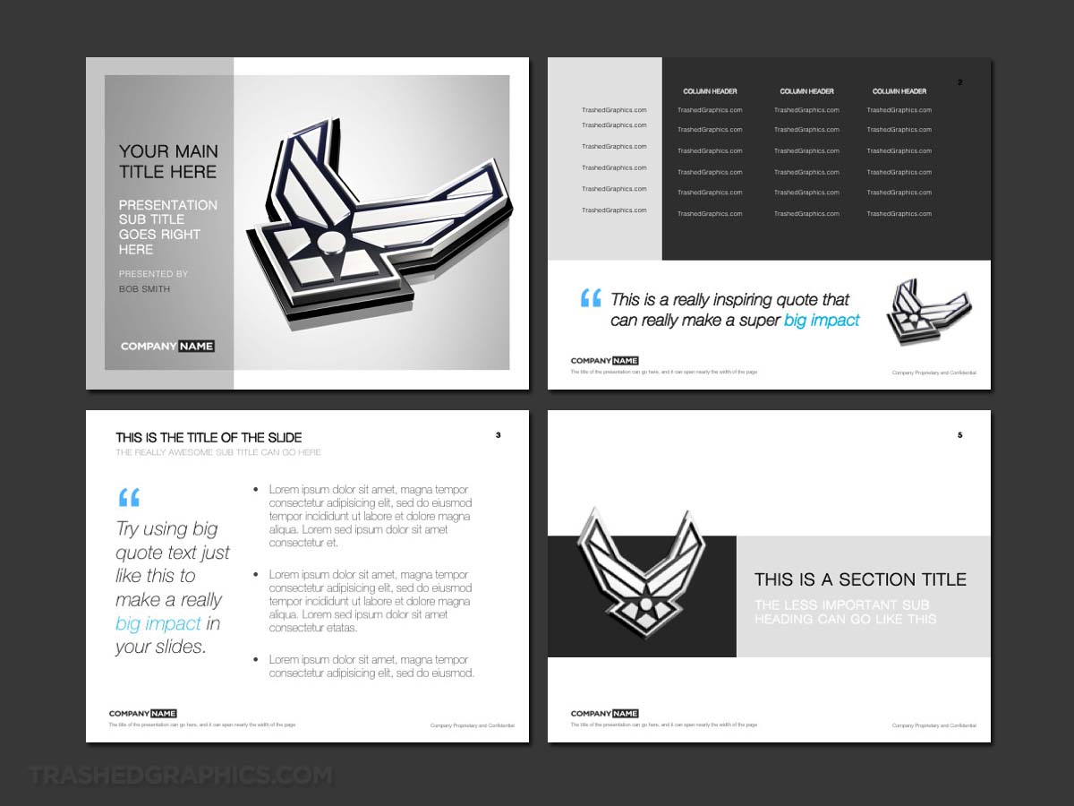
The rest of this Air Force PowerPoint template follows the design language of the cover slide. There are lots of silver and white textures everywhere (very similar to my Cloud Computing PPT), with none of it being so overpowering that it drowns out your content. It’s essentially the opposite of my Purdue PowerPoint template (which is very heavy in terms of graphics).
There’s a dedicated text slide which is relatively simple – but effective. The table slide is large and expansive, built to contain a lot of top-secret highly classified data (lol). There’s also a section title page which is useful for breaking up the content of your presentation and making the transition from section to section more noticeable and clear.
Note that all slides are highly editable and easy to modify. Since I know that not all presentation content is created equal, I made sure that each specific element can be rearranged (or even deleted entirely) if you choose. The only minor exception to that is the cover slide – all of the elements except for the text are baked into that one so that’s pretty much what you’re going to get unless you overlay other graphics on top of it.
And, just because I’m feeling generous, I’m also going to include a high-resolution (2000x2000px) rendering of that US Air Force logo on its own. This should be extremely useful for helping you to create other highly visual slides based on this overall design language.
Another version of the template with a stronger color palette
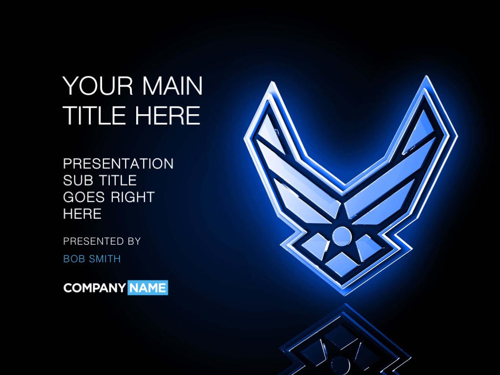
This is the US Air Force PowerPoint template I set out to create right from the beginning. Even before starting, I had visions of a rich deep blue theme with a glowing white 3D model of the US Air Force logo floating around in different sections of the theme. I also wanted to use a lot of white in the content slides, just to balance out the heavy blue color found elsewhere in the theme.
The cover slide turned out exactly how I imagined it would. The background color is a dark blue gradient which allows the 3D Air Force logo to pop off of it in a very compelling way. The title of the presentation and all of the subheadings beneath it pop off nicely as well thanks to the richness of the background texture.
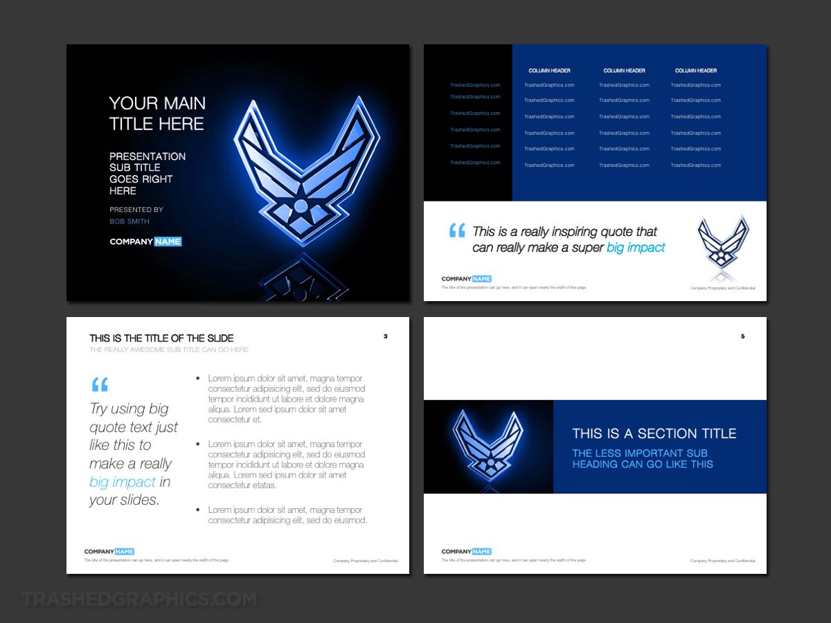
The content pages of this bold Air Force PowerPoint template are slightly more reserved than what is on the cover slide. After all, nobody likes to squint when reading presentation data, so I made sure to optimize the contrast as best I could.
It should also be noted that the dark blue gradients in this theme are designed to glow very nicely when presented in a dark room on a projector.
That’s actually the hidden beauty of presentation design! What you’re seeing here on your computer screen or mobile device is not exactly what you’re going to see when projected. This is an example of a PowerPoint template which comes alive on the big screen, And you really have to see it to believe it (my brain PowerPoint template has this same effect).
I’d recommend taking a screenshot of this template preview and projecting it in your nearest conference room just to see what I mean. Notice how the blue colors look like they’re glowing? You’ll also notice that it doesn’t overpower the content either. That’s definitely the kind of visual attribute you need in a good PowerPoint template.
Oh – and just like the silver Air Force PowerPoint template I posted up top, I’m also including a high-resolution (2000x2000px) rendering of the glass Air Force logo over the blue background. Feel free to use it however you like!
Pro tip: Mix and match pages of both of these templates for the ultimate Air Force theme
One of the really nice things about metallic textures and deep rich colors (such as blue) is that they go together like peanut butter and jelly. Any of these slides from either template would work very well together – so get creative and mix it up a little!
If you don’t want to buy those templates, you can still achieve a really nice look by changing out some of the gray and silver sections in the first template to a solid shade of dark blue. FYI, the official blue color of the US Air Force is #0F182D (R:15, G:24, B:45).
You could also swap colors with the blue template, but adding realistic and metal textures is slightly more difficult. If you’re not comfortable with Photoshop and/or the PowerPoint graphics editing features, mucking around with the silver template by adding in solid shades of blue is the way to go.

No Responses Yet