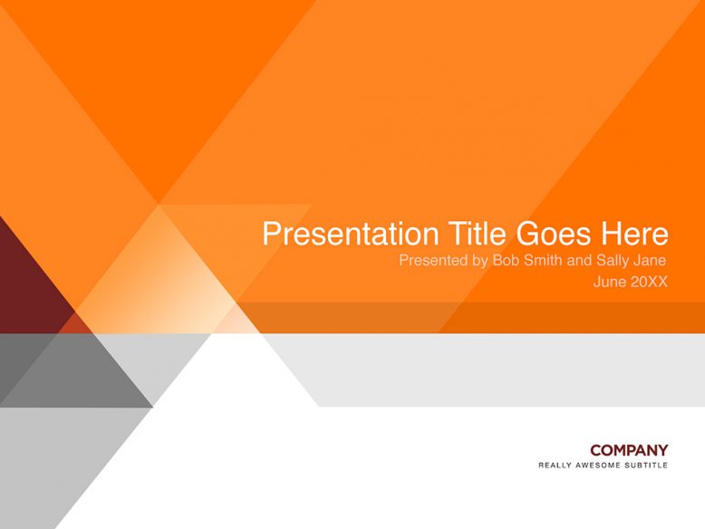
This was a presentation template that I was working on that I just…couldn’t…get…right. You know how it goes: you’ve got a really good design idea in your head, and you think it’s going to be brilliant once you put everything together. But one little graphic element doesn’t work so well and you spend hours trying to fix it – but then once it’s fixed, it makes the rest of the design look unbalanced! Yep, that’s exactly what happened with this one and it was tough to give it up and move on.
The reason for the hard angles is that the client I was designing this for had a very hard-edged corporate mark. Their logo was very angular and hard-eged, and I wanted to make a presentation template that reflected that. I think I sort of got close, but that big white space on the bottom right of the cover page bothers me greatly.
Please note that this is a PSD template only – you’ll have to import it into PowerPoint (or keynote) yourself. As a bonus, an interior page is included.


No Responses Yet