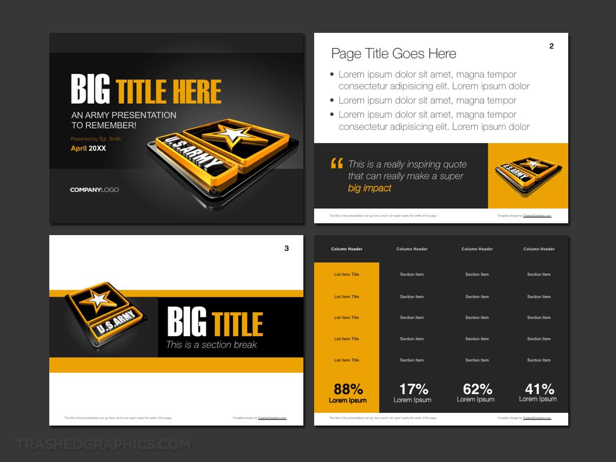
A few days ago I was sitting around with nothing to do and I started thinking about the current US Army logo. I’m not a logo designer by any means, but I think it’s one of the best I’ve seen in recent times. And because it’s really hard for me to leave something alone, I couldn’t help but to create a 3-D model of it. Once completed, I thought the next logical step would be to create a four-page Army PowerPoint template.
To be honest I’m not really sure how much demand there really is for an Army PowerPoint template. But if you’ve been following my work for any amount of time, you know that I just can’t resist creating a PowerPoint templates for nearly anything.
Heck, I even created a Google Plus template recently, which, thinking back on it, was really stupid considering that the brand is as good as dead now since the service no longer exists. I just happened to like the logo a lot, so that was all the excuse I needed for such a time-wasting effort.
However, with the US military being as prominent as it is, I’m willing to bet there will be at least a few of you out there who have an actual need for a versatile US Army PowerPoint template. And who knows? Depending on how well this slide deck is received, I may even keep it going and create templates for other military branches as well.
A detailed description of this four-page PowerPoint template
Before getting into the nuts and bolts of each slide and what they consist of, I just want to say that this entire slide deck is incredibly versatile and it’s really easy to edit and modify. Therefore, if you see a certain slide that isn’t quite what you need, don’t worry. All of the elements are completely rearrangeable, and it’s not all that difficult to morph this into an Army PowerPoint template all your own.
The cover slide
No US Army PowerPoint template would be complete without a prominent logo displayed loud and proud as the first thing you see. I used gray as a base color for the majority of this cover slide, which makes the white and yellow colors in the logo pop really well. It’s a little visual design secret of mine that I use in a lot of my other templates (such as my Purdue PowerPoint theme).
I also decided to use a slightly older font that I normally do for the titles. This is because I figured the military is all about strength and power, so using a light font such as Arial or Helvetica like I normally do just wouldn’t be appropriate here. If you’re curious, that big and bold font is none other than Haettenschweiler.
The text slide
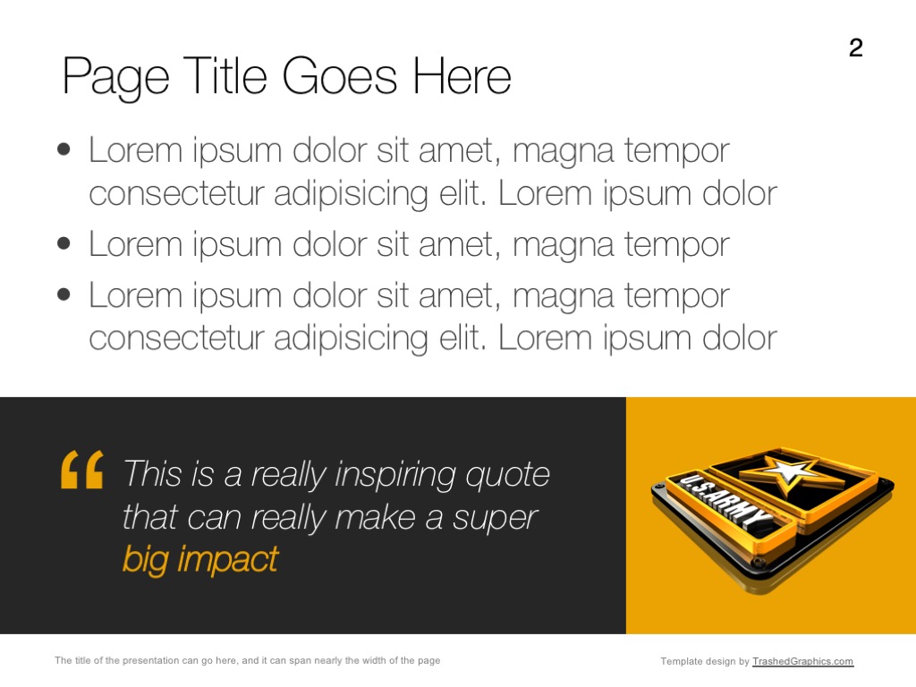
OK, this is the slide in this Army PowerPoint template where I suspect that many of you will want to do the most modification. As a veteran of the corporate world who spent 20 years giving presentations, I know full well that a page with nothing other than bullet text is usually the most useful slide in any PowerPoint deck.
So why did I include a thick colorful banner at the bottom of this one? Because I’m a visual designer who feels like I needed to add a little bit of extra spice to keep things interesting.
Please note that the banner at the bottom of this page is completely editable and you can even remove it altogether if you need as much room as possible for your text. You can even replace the contents of those boxes with whatever else you want to put there.
FYI, interesting statistics and small (very simple) charts are usually good to put in containers such as these. Just an idea.
The table slide
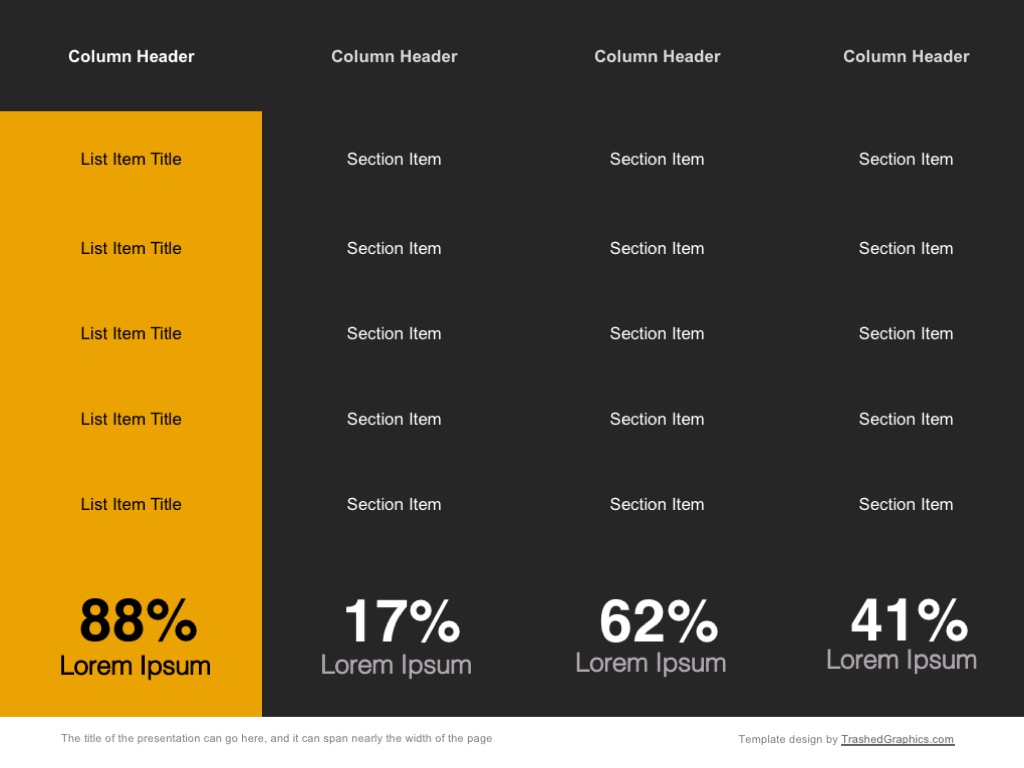
No US Army PowerPoint template is complete without massive tables of data. I’ve personally never spent any time in the military, but I have family members who spent an entire career in the army. And from what I’ve been told, they were always working with a lot of data.
Since the US Army data is likely very dense and complex, it was important for me to make this table slide as large as possible. No space has been wasted, and it fills the entire page from top to bottom and side to side.
It’s also extremely easy to modify. You can add as many columns and rows as you need with PowerPoint’s easy to use table building tools.
The transition slide
I’ve already mentioned that I am a 20 year veteran of the corporate world. I’ve given a lot of presentations in my day, and I’ve sat through thousands more. One of my biggest pet peeve‘s about an inexperienced PowerPoint presenter is that they forget to include transition slides from section to section.
These transition slides don’t need to be anything fancy. Just a simple block of text is often sufficient, and it’s even OK to add a little bit of color and other flair to help keep things interesting.
In the case of the transition slide for this Army PowerPoint template, I decided to use the US Army logo to balance out the bold font of the section title. If it’s a bit too bold for your particular preference, you can remove or edit any element however you wish.
Bonus: I’m even going to include a full-size 3-D rendering of the US army logo as well!
In order to make sure that I’m giving you all of the elements you need to create the most epic Army PowerPoint template ever, I’m also going to include a full-size 3-D rendering of the logo that you can use for any purpose within the presentation.

The template also includes a 2000x2000px high resolution 3d rendering of the US Army logo (without the TrashedGraphics.com watermark of course).
This full-size rendering can be used in place of the transition slide I showed above, or you could even use it to replace the background graphic in the cover slide.
Heck, you could even use it as the background for a poster which you can create to build excitement and awareness for your presentation. It’s uses are limitless, so don’t be afraid to get creative and think outside the box.
Final thoughts about this US Army PowerPoint template
All four slides in this US Army PowerPoint template have been designed to give you the platform you need to build out an incredibly useful and content-rich presentation. I encourage you to mix and match elements from all of these pages into something that fits your content the best way possible.
Additionally, the visual design language of this slide deck is relatively simple (unlike my brain PowerPoint template lol), and consists of plain colored boxes. Therefore, it shouldn’t be all that difficult for you to create additional slides of your own based on this simple design language.





No Responses Yet