Oh man. I’m having all sorts of crazy corporate flashbacks now. In the first half of my career (which ended two years ago), I worked for a handful of very large tech companies here in the US. My role in each, of course, was “visual designer” for UX teams. However, despite being fully integrated into large user experience teams, I always found myself putting together cloud computing PPT‘s for the IT department. It’s amazing (and a bit funny) how deeply-entrenched corporate culture is on this whole “cloud computing” thing.
Anyway, creating the images needed for this cloud computing PowerPoint template brought back a wave of memories for me. These memories were both good and bad.
On one hand, I never much liked working on projects for other people. Even though they were paying me handsomely for my time, the selfish part of me was never satisfied. On the other hand, I had the opportunity to work with some amazing people in the corporate world over the past 20 years. But I’m getting off track here. Let’s focus on the slide deck and what it can do for you.
A brief summary of this six page cloud computing PPT
I’ve never been shy about admitting that I’ve got a thing for glossy and metallic textures in all of the illustrations that I create. Heck – I even managed to integrate shiny metallic objects into my brain PowerPoint template that I uploaded just last week. It’s a sickness, but I’m totally OK with that.
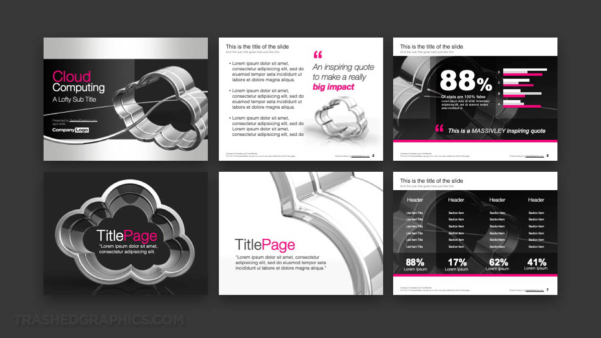
This cloud computing PowerPoint template consists of six pages:
- Cover slide
- Text slide
- Data visualization slide
- Section tile slide A
- Section tile slide B
- Table slide
The entire slide deck is based around a 3-D model of a cloud computing icon I built several years ago. Just as I do with all of the PowerPoint templates that I create, I like to reuse the same object in different ways on every slide.
From my baseball PowerPoint template to my virus PowerPoint template (and everything in between) I like to work with one 3-D model and see what I can do to create a variety of different illustrations from it.

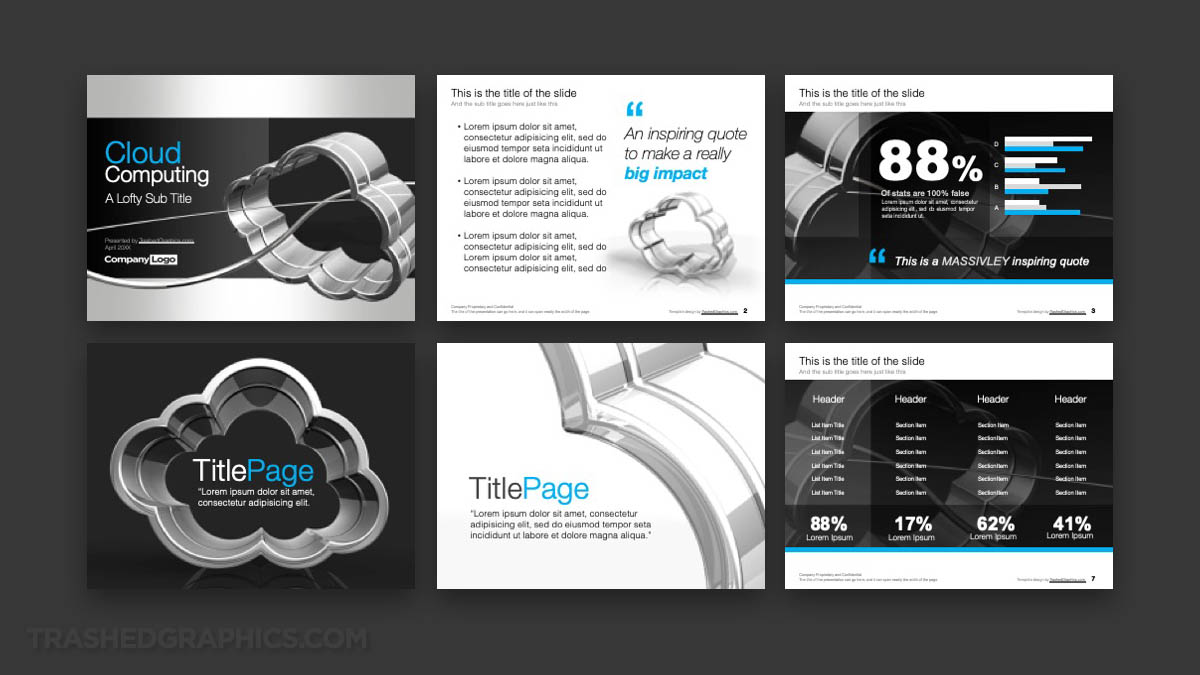
Also included is this alternate-color version. You’ll get both the blue and pink versions with your purchase!
Every page in this slide deck features that 3-D cloud in some form or another. Even in the data visualization and table slides, the background element features a dark image with a watermarked version the cloud. It’s hard to see it at first, but it’s there. It helps to officially tie his entire PowerPoint template together IMHO.
How easy is it to change the colors in this template?
Extremely easy! All of the renderings that I created for it are grayscale, and the color elements that you’re seeing (such as text and color blocks) were created within PowerPoint. These particular elements are fully edible and you can change them to whatever color you want.
The first version of this cloud computing PPT that I created was the pink version. This is because I used my brain PPT as a starting point, and I liked the way that the pink accent colors worked with my grayscale renderings. However, as a veteran of the corporate world, I know for a fact that there are very few IT departments in this world that would be comfortable using a slide deck with so much pink in it.
That’s one of the reasons why I also created the blue version that you also see above. The other reason that I created it was to show you how easy it is to change the colors to whatever you want.
What version of PowerPoint is this cloud computing slide deck compatible with?
It’s fully compatible with them all versions of PowerPoint. I make it a point to keep my slide decks as simple as possible. Because of the fact that I’m not using any version-specific graphic elements, this template will open in nearly any version of PowerPoint.
Despite what you may be thinking as you examine the preview images above, this PowerPoint template consists of four basic kinds of elements:
- Background images
- Text blocks
- Basic shapes (rectangles) without any special effects like gradients and drop shadows
- Basic tables
Cloud computing is a fairly dry topic anyway, so there was no legitimate need for me to go crazy with unnecessary special effects. Sometimes it’s better to keep it as simple as possible!
What are the fonts used in this cloud computing PowerPoint template?
Again, I’m trying to stay as simple as possible. Therefore, the only fonts used in this template are Arial and Helvetica Neue. Most any computer operating system built in the last 30 years will have aerial pre-installed, but you may have to purchase Helvetica Neue if you don’t have a subscription to Adobe Creative Cloud (which comes with a large font catalog).
I should mention that Helvetica Neue is a fairly simple font anyway, so if you don’t have it (and you don’t want to purchase it), you certainly don’t have to. Any thin sans-serif font that you have preinstalled on your computer will work just fine. Don’t be afraid to get creative and experiment with different styles that you like.
In my opinion, a thicker font such as Impact would work very well for a cloud computing slide deck such as this. That’s the font that I used in my Army PowerPoint template, and I quite like the way that turned out.
What’s the overall size?
This is one of my smallest PowerPoint templates yet! I worked really hard to optimize the images in this one, and the final size comes in at a paltry 593 KB.
How easy is the slide deck to edit?
It’s extremely easy. The only elements created outside with PowerPoint are the renderings of the clouds themselves. All of the other graphics (such as text, tables, charts, graphs, etc) are native PowerPoint objects. All of these objects can be easily edited and positioned wherever you want.
Master slides are included, and were purposefully left as basic as possible so as not to make this template too difficult to edit.


No Responses Yet