I’ve mentioned before that I’m a huge fan of the simplicity of flat design, and if I’m being honest, it’s really dang hard for me not to use that style in everything I design. Especially minimalist powerpoint templates! But I can’t resist every now and then, so here we go with three of my best PowerPoint templates with a flat-design theme:
Flat design PowerPoint template built with table grids
I was recently experimenting with some different ways of building PowerPoint slides, and I discovered that using tables as a grid to place content into actually works pretty well. Normally I just place my content onto my slides in a free-form manner, not worrying too much about a grid other than making sure that all my headers and content blocks are in the same place from page to page. But using tables to control layout and placement of elements is really nice because it just simplifies everything greatly. I can just add a table wherever I want, and then add content into it. It’s basically modular PowerPoint design – after I’ve got a block of content looking the way I want, it’s easy to resize or move however I want.
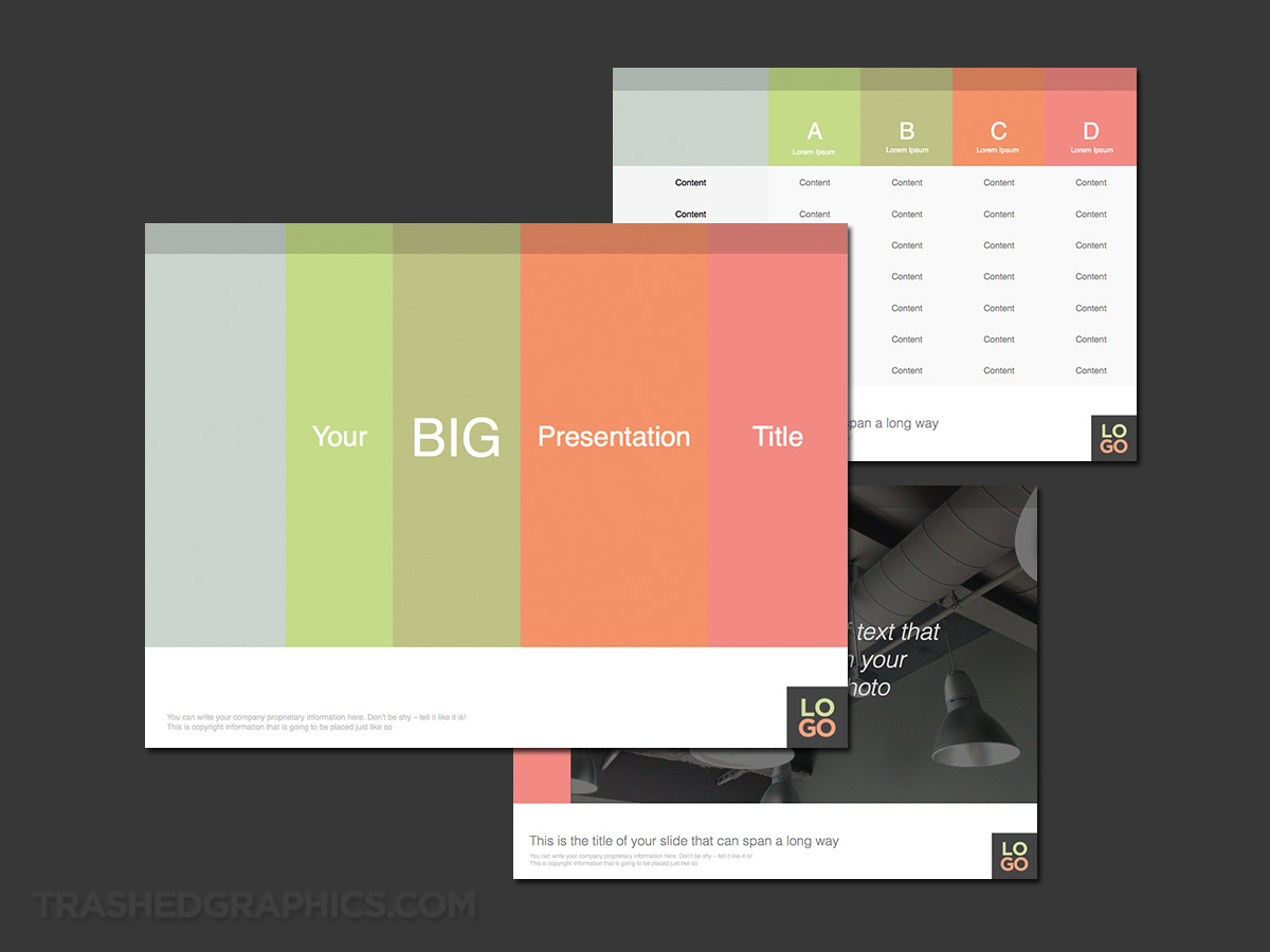
Table-based theme with vertical columns of light colors – these colors are fully editable by the way, so change them however you want!
Since this was just an experiment, the visual design of this presentation deck isn’t all that exciting. As a matter of fact, it may be too simplistic for some (even those who like minimalist powerpoint templates), and I know that the color scheme isn’t going to work for everyone. The good news is that since this is a table-based minimalist PowerPoint template, you can change the colors however you’d like without breaking the structure of the pages. And although it wasn’t intentional, the style is a bit similar to a Keynote template that I uploaded last year, which also features a flat design language with vertical bands of light colors.
The ability for anyone to easily make quick edits is one of the best things about grid-based minimalist PowerPoint templates. There are no complex color effects and fancy shapes to tinker with – just blocks of flat color that can easily be changed by anyone without having to asking for professional help. As a visual designer, this benefits me greatly (obviously) because I can spend more time being creative rather than trying to modify PowerPoint slides to someone’s own personal taste!
Blue and green flat grid theme for PowerPoint
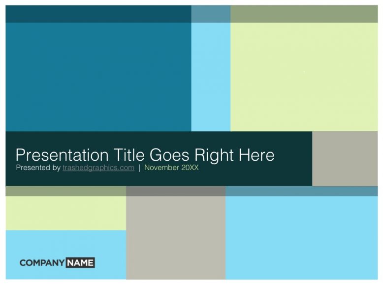
If the style of the previous slide deck isn’t your particular flavor, here’s an alternate version with a slightly adjusted color palette using green and blue tones. I’ve also modified the grid structure a bit, thinking of different ways to contain (and showcase) different pieces of content.
Please note that this entire grid structure was built entirely within PowerPoint, meaning that it’s fully editable and you’ll be able to adjust the sized of the grids (or obliterate them completely) to match your content. I’d also recommend filling some of these containers with muted photos of your products or services, much like how I did in the template just above this one (as well as the Heating and Air Conditioning template I created a while back). As always, I encourage experimentation to make these templates your own!
Flat design (and vividly red) PowerPoint template
I’ve had this angular red minimalist PowerPoint template sitting in my archives for over a year now, so I figured that it was time to finish it up and get it uploaded. My problem with it is that I feel like it’s overly simplistic – and I get the feeling like something is missing every time I look at it. But then again, maybe that simplicity is what makes this template worthy of uploading. I’ve always preached that presentation templates shouldn’t detract from the content being presented, so keeping things simple is often the best way.
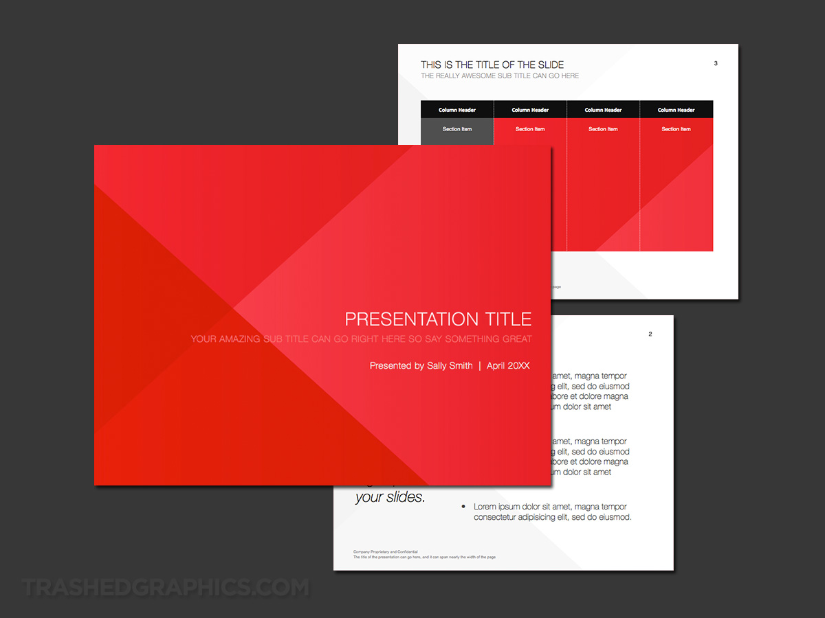
An angular red / flat style theme which is simple enough to be used for a variety of topics. Note that the vector source file for the cover slide graphic is included with this template, so it’s easy to change it up to match your own brand colors.
Flat design tends to accentuate simplicity, and even before I started working on this one, I knew that it wasn’t going to be one of my most visually interesting templates. I do like the whole flat design trend – but I know that many people do not, so that’s why I don’t do more of these kinds of templates. But if I had my way, I’d be doing minimalist design for everything I create!
One other thing that bugs me about this theme is that the red is very bright. That will severely limit it’s use, but it may be perfect for a high-energy startup company who is looking to stand out at their next big meeting. I certainly wouldn’t use this template trying to sell health care equipment to a large medical company, but it would be perfect for smaller and more energetic meetings where minimalism is beneficial.
If you agree that the red is a bit too bright, you’re in luck! The vector source file for the cover slide image is included with this template, so feel free to customize it to match your own company brand colors.


No Responses Yet