Yesterday afternoon I was tinkering with some PowerPoint theme ideas, and considering that I had recently finished building a 3d model of the Eiffel Tower, it shouldn’t be much of a shock to know that I came up with a “France” PowerPoint template. Complete with images of the Eiffel Tower and and abstract French flag on the cover slide! I’m not particularly sure how useful these PPT templates are going to be compared to others in my collection, but I was happy to make them anyway.
Paris France template for PowerPoint
I have always made it a point to keep politics out of my visual design work, and this template is no exception. There’s really nothing about this theme that is overly political and stuffed to the brim with subliminal messages. It’s just a basic red white and blue France PowerPoint template with images related to France and the city of Paris. Being so generic is probably for the best anyway – I can see this one being used for travel related presentations that aren’t even related in any way to France.

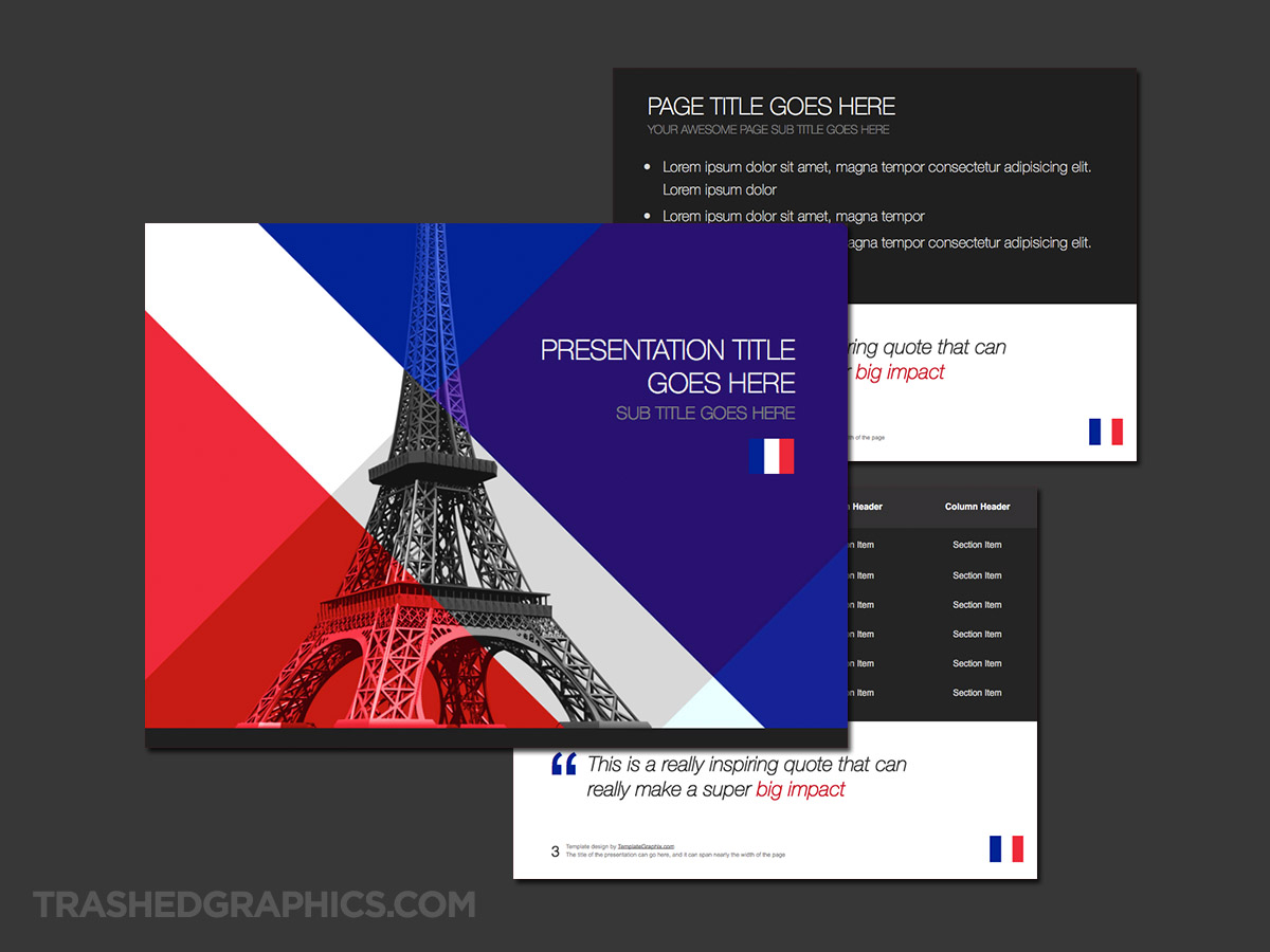
Fully editable Microsoft PowerPoint presentation template with a red white and blue Paris France theme.
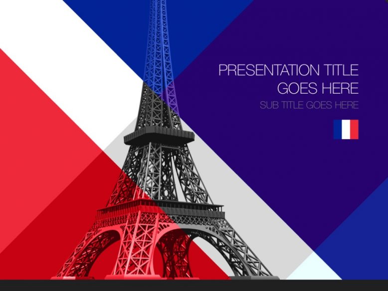
The cover slide is a bit more abstract than I had originally intended. I started out with a simple (flat) image of the French flag, then placed the Eiffel tower over it and called it done. Bu it just seemed so sterile and not as visually interesting as I had planned it to be. So I played around with the flag a bit, rotating it 45 degrees, adding several different layers of it, and adding some transparency.
The result is an angular abstraction that doesn’t look like a flag at first, but holds true to it’s original shape and color. An added bonus is that the rotation angle matches the lines of the Eiffel tower a bit, so I got lucky with that one (I didn’t plan it that way). Speaking of the tower, I added some transparency to that as well to help integrate it into the slide better. PowerPoint templates don’t get any more “France” than this!
The interior slides are a bit different than the cover. Here you can see that I decided to use large blocks of dark gray as background elements for the main content, while reserving the red, white, and blue colors of the flag for the little details. Each slide has a French flag in the lower right hand corner.
Bronze and gold Eiffel Tower PowerPoint template
I’m not totally enthusiastic about posting this all-bronze France-themed PowerPoint template. It’s not what I had in mind at all before I started working on it (a recurring problem I have as described in my Puzzle Pieces template post), and I almost threw it in the trash bin in disgust once it was all done. The problem was that I had thought I started with a really good idea, but I was never able to get the look completely right. And the more I tweaked and tuned the design, the worse it looked. Total bummer!

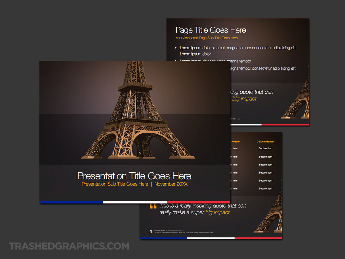
Fully editable Microsoft PowerPoint presentation template with a dark bronze Paris Eiffel Tower theme.
My goal was to design a France-based PowerPoint template featuring the Eiffel Tower. I wanted the color palette to match the tones and textures of the tower itself, and in my mind I thought this was going to look really good. Ha!
I started out by creating subtle bronze and gold gradients to use as the background color for each slide, and then I messed around a bit trying to find ways to integrate the tower. For whatever reason, I just couldn’t seem to get the combination of typography, text, and color to sync with one another and the result is this muddy mess you see here. Swing and a miss! But I know that style and design is subjective so I decided to post it anyways in hopes that someone would like it.
If there’s one thing that I do like about this very “France” PowerPoint template, it’s the fact that it contrasts the colors of the French flag nicely. I thought about creating a highly-transparent version of the flag as a background graphic (over top of the bronze gradient), but the red white and blue really stand off of that color in a nice and super-vibrant way. That’s why there is a narrow ribbon of those three colors at the bottom of each slide.
As I said before, I’m not really sure what use anyone will have for these France templates besides using them for travel topics. But I was happy to make them anyway, if only as a tribute.


No Responses Yet