I’m not much into social networking, but I’ll admit that Instagram is fun. I’ve got several accounts (my design-related account is @norebbo), and it’s the only social network that I truly enjoy posting on. All the others – not so much. I’d rather be creating content than posting stuff on Facebook and Twitter! Making a series of Instagram themes for PowerPoint qualifies as “fun” too (I guess).
My first Instagram PowerPoint theme concept
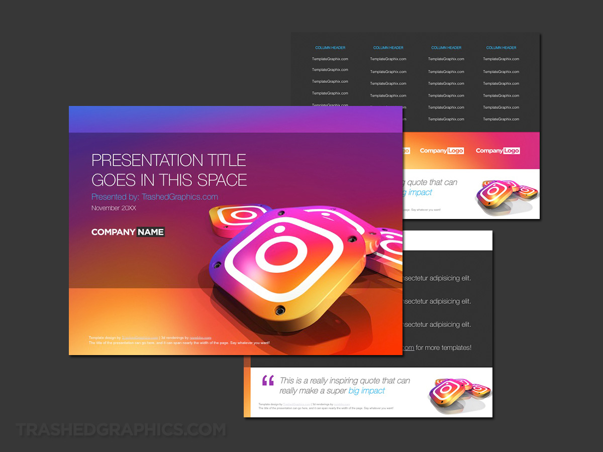
The fact that I enjoy Instagram so much makes it all the much more easy to understand why I had so much fun creating a PowerPoint template theme for it. The focal point of this first template is by far and away the tie-die neon gradient color scheme – which I’ll admit was a bit out of my comfort zone due to my love of the color gray.
I also like metal textures (as you could probably tell by looking at my Purdue PowerPoint template), so this was a challenge for me.

Colorful 3-page 2018 Instagram PowerPoint theme. More colorful than my Facebook PowerPoint template. By a lot.
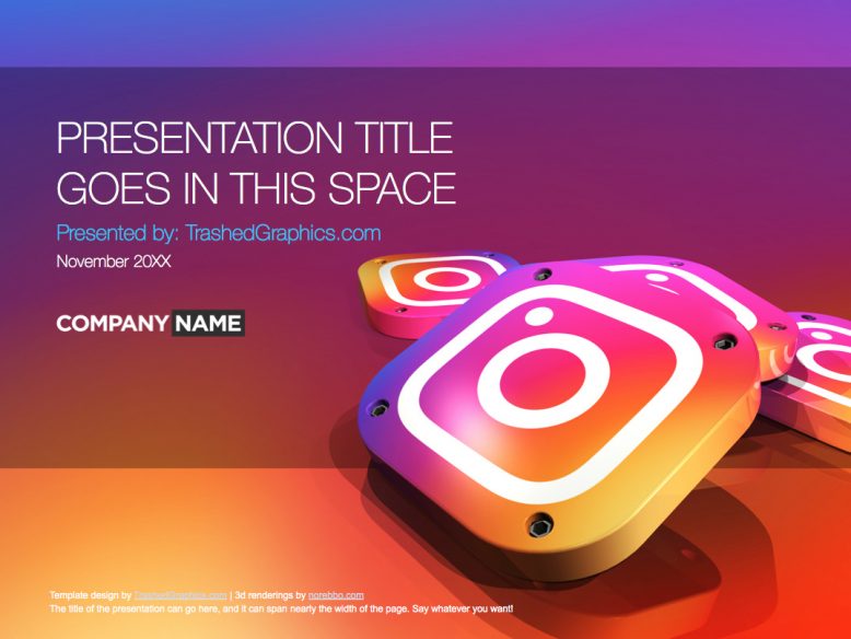
The cover page is by far the most eye-grabbing page of this 3-page ppt template, featuring a large pile of 3d Instagram app icons in the lower right corner. The background is either nauseatingly bright or beautifully balanced depending on how much of a fan you are of the current Instagram brand colors – though I did try to tone things down a bit on the interior slides.
Instagram networking PowerPoint template
The problem with the IG brand colors is that it’s a palette I feel somewhat uncomfortable working with. And it’s exactly why the Instagram PowerPoint template I posted above gave me so much heartburn and I naturally reverted back to dark gray boxes and containers for the content pages. But deep down, I knew it was a all wrong – especially for a brand language so rich and vibrant as this. I just had to give it another go.
This four-page Instagram template uses the same colors and gradients as the one at the very top of this post, but I made it a point to use as much white as possible on the interior slides. To prevent myself from straying off track (because I know me and straying off track is something I always do), I decided to base this template one one of my old Facebook PPT themes. My older PowerPoint templates tend to be much simpler, which in the grand scheme of things, is probably best when it comes to PPT slide design.
And because this Instagram PowerPoint template shares the same color palette as the one at the top of this post, it would be very easy to combine them into one larger template with a wider variety of tables and content block styles.
By the way, do be sure to check out my virus PowerPoint template if you like this color scheme (and are looking for themes with a similar flavor).
There’s also a version with the old Instagram logo (because retro is cool)
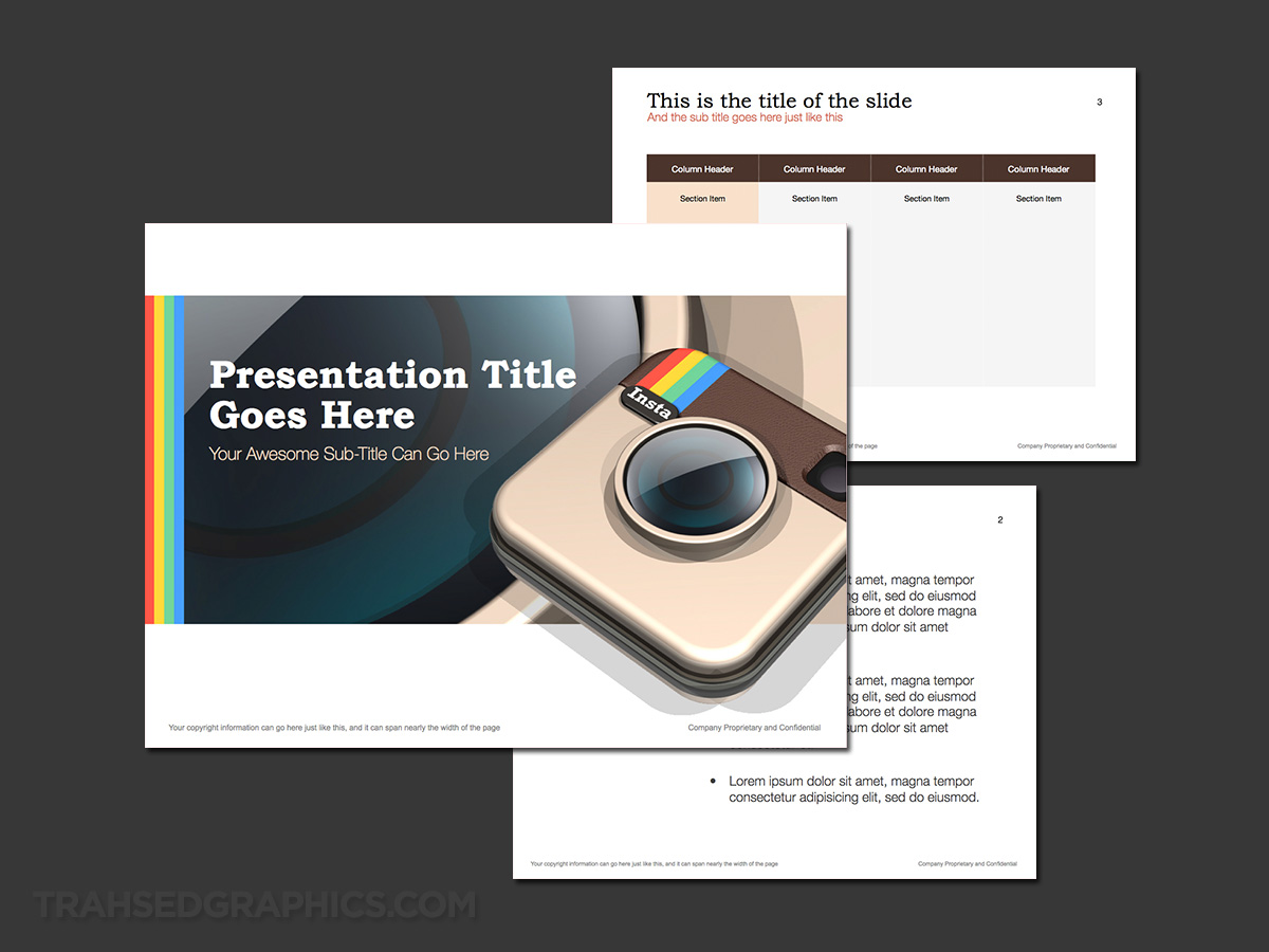
Dedicated to all the die-hard fans who loved the old 3d-style Instagram logo, here is a retro version with that old familiar style. The cover slide features a large rendering of a 3d Instagram app icon which I made many years ago, and I placed it over top of a large version of the lens texture from the icon itself.
At first glance it may appear to be just an abstract gradient, but it’s actually part of the icon illustration. I did choose to keep things much more simple on the interior slides though – as I’m a firm believer that the best PowerPoint templates only carryover elements from the cover very sparingly – with a few select colors strategically placed within certain elements.
I also wasn’t sure what to do with the typography of this retro ppt template. I wanted to stay with the Instagram theme as much as possible, so I let go of my tried and true Helvetica font that I’ve been using on nearly every template I’ve created for the past year or so and used Bookman instead.
This is very close (but not totally identical) to the typeface used for the “Insta” text in the app icon, so I went with that for the titles. That weird font choice makes me unsure if this is one of my best PowerPoint templates though, but you can certainly tweak it however you’d like from within the slide masters.


No Responses Yet