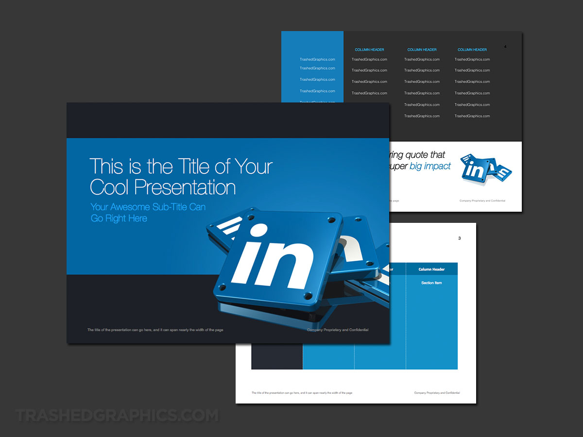
A long time ago I created some 3d LinkedIn logo illustrations for my royalty-free stock image collection, and I was happy to see how people used some of them. I saw these illustrations on business cards, websites, presentation templates, – and even a t-shirt! Unfortunately, the presentation templates I saw were very simple and I always thought about making some of my own. So I rolled up my sleeves and created a visually rich LinkedIn PowerPoint template that I could be proud of.
A brief overview of this LinkedIn PowerPoint template
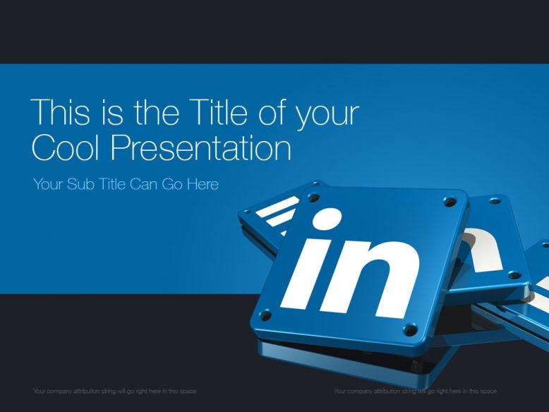
The cover slide features a slightly modified version of one of my most popular LinkedIn logo illustrations. It consists of a pile of 3d LinkedIn app icons arranged in no particular order, placed over top of a two-tone blue background. The right side of the slide is very image-heavy but the left is kept clean and open for your title text.
Speaking of title text, I should mention that I know that I always seem to provide the same phrase over and over again for all my templates (“Your Cool Presentation Title Should Go in This Space”) so apologies if you are sick of that by now. I’ll try to change it up in the future…

Fully editable Microsoft Powerpoint presentation template. Includes cover, text, and table pages. Blue LinkedIn theme.
The rest of the template uses a color scheme that plays off the vivid blues in the LinkedIn logo, which makes the whole thing seem dark, but still vibrant and colorful. It’s the same way I colorized my Purdue PowerPoint template (using the brand colors makes it so much easier).
And if you feel that there is too much blue here, adding orange accents here and there will brighten up the template a lot while still staying true to the brand. I know that many of my templates are very monochromatic (well, maybe except the brain PowerPoint template lol), and some people don’t like that – so feel free to experiment and make it your own!
A few different ways to use this LinkedIn PowerPoint template
I think there is a lot you could do with this template, especially considering how hot social media topics are at the moment. Even though this template only features one brand, I believe it’s still fully relevant for any topic related to social networking in general.
- If you own (or work) for a social media marketing agency, this LinkedIn PowerPoint template is an ideal tool to help sell your services. Even if the focus of your business covers all social media channels, it’s still a very effective template to use since it features one of the most popular and productive social media networks around at the moment. Can you imagine how much of an impact you’ll make if you walk into a meeting and kick off your presentation with the cover slide of this deck? Even if you don’t totally know what you’re doing with social media marketing, it’ll help you look like you do. By the way, I’ve also created slide decks featuring other popular social media brands such as Instagram, Facebook, Snapchat, and Pinterest.
- Somewhat related to the first point, I could see this template being used by marketing departments in large and established corporations. I’ve worked in enough Fortune 500 companies to know that many of them are set in their old and traditional ways, and the younger and more “in tune” marketing departments always struggle getting through to upper management. Still, even in this day and age, many corporations don’t understand and appreciate the power of having a social media presence. Use this template to help you drive the point home that social media marketing is here to stay and it behooves them to get on board. Of course I can’t provide you with all the juicy data to help you make that point, but the visuals of this LinkedIn PowerPoint template are strong enough to keep all eyes on the screen.
- Another way that I’ve seen this template being used is by college students presenting data on social media trends. The relatively simple and easy to modify slides are the perfect base for structuring your data in a way that will blow some minds. Don’t waste precious research data on an ugly slide deck!
How to make this LinkedIn PowerPoint template your own
Every single PowerPoint slide deck that I create is highly customizable with the user in mind. I’ve done enough presentations during my 20 year stint in corporate America to know what works and doesn’t work in a good PowerPoint template. That’s why I’m such a stickler for letting you modify these slides as quickly and easily as possible.
To create more visually interesting slides based on the LinkedIn theme I’ve already created, I’d recommend using large blocks of color (blue or orange) to break up text slides so they’re not so dull and painful to look at. Never create an entire slide containing nothing but text! That’s a sure fire way to lose your audience, so keeping things visually interesting will prevent anybody from interrupting your presentation with obnoxious snoring.
Even better, I’d recommend keeping your slides extremely simple (check out my Air Force PowerPoint template for an example of a rich but simple design).
Have you considered limiting each slide to one bullet point? It’s an extremely effective way to hold the attention of everyone in the room, and if you can manage to sprinkle in a little bit of LinkedIn blue here in there, you’re going to have a winner of a slide deck.


No Responses Yet