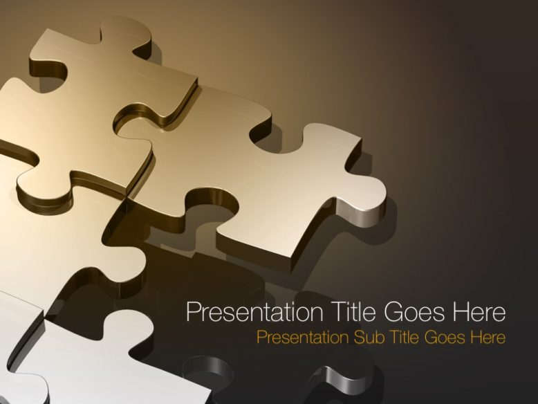
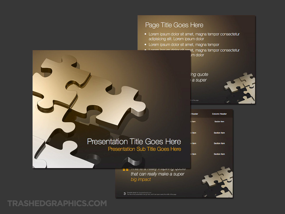
Ok, I know this is a bit cliche, but here’s a PowerPoint puzzle template that would be perfect for a wide variety of corporate strategy topics. I created my first template using puzzle pieces as the main element a long time ago, and to be quite honest with you I’m rather shocked that I haven’t done any more since.
The metaphors you can attach to a puzzle piece are just too easy: building, strategy, construction, business, growth – the list goes on and on and it’s probably why you see so many stock photos of puzzles everywhere. It may be cliche at times, but no matter – because it’s still totally relevant!
Some thoughts about this puzzle-themed PowerPoint template
The primary reason for putting this slide deck together is that I never really liked that other puzzle template I created a long time ago (that I refuse to show anyone because it was so bad). The colors were much too rich, the design was too busy, and I knew I could do better than that.
So I gave it another shot with this one, trying to keep things as simple as possible while not letting the images of the metallic puzzle pieces get in the way of the content. And you know what? I think this one turned out much better. At the very least it gave me confidence that I’m actually growing somewhat as a visual designer. Ha!
This PowerPoint puzzle template turned out better than I expected (I was worried that it was going to be too dark), and to be quite honest, it’s a slide deck I’d love to use for any of my own presentations.
I think the best thing about this ppt template is that the metallic textures over that dark bronze background color (on every slide) are very rich. This means that it will work very well with a lot of light-colored text placed over top.
By the way, if you like the look of a bronze / metallic theme, do be sure to check out my PowerPoint template featuring the Purdue logo. That one has the same sort of “rich” vibe as this puzzle template.
I am a bit bummed that it looks very similar to my recent France-themed template, but that’s just the way it goes sometimes. Not every design is a going to be completely unique – and many times I don’t even notice the similarities until it’s finished and I’m comparing it to past work. It is a bit frustrating though, since it’s further confirmation that I have a very clear and defined visual design style that flows from project to project. That’s not necessarily a bad thing – but I would like to be more diverse in my design work.
Powerpoint templates for corporate strategy are huge, so I know that I’ve got to try this again. Next time, I think I’m going to do a flat version (in a style similar to some of my other flat template designs), with 2 vector puzzle piece shapes instead of these massive 3d pieces. I’m also going to make sure that the illustrations are separate from the backgrounds so that you can move them around to fit your content. Yep – I’ve created nearly 200 presentation templates so far and you can see that I’m still learning as I go!


No Responses Yet