It’s been roughly 2 years now since I left the corporate world to go off my own as a self-employed entrepreneur. However, having worked for the man for nearly 22 years, it’s still really hard for me to let go of the more hard-core corporate business stuff bouncing around in my head. I’m still creating PowerPoint templates obviously, and this post is all about my latest super-geeky creation: a supplier chain management PPT.
I mean, seriously. As frustrating as it was working a corporate 9-to-5 job for so many years, I still can’t stop thinking about corporate business strategy (and all the drama that comes along with it). I thought for sure that I would be leaving it behind me like a garbage bag full of stinky…garbage, but here I am happily presenting this supply chain PowerPoint template to you fine folks.
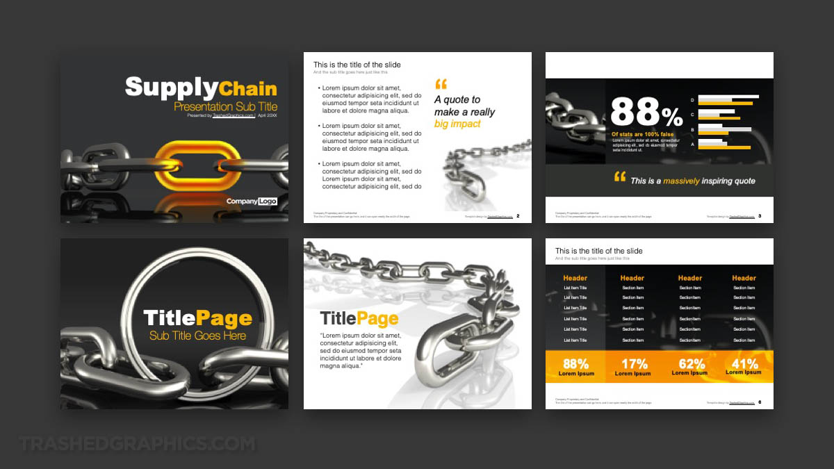
A brief summary of this 6-page supplier chain management PPT
To be honest, the idea for this slide deck came about as I was browsing some of my old 3d renderings that I did for a different project about 10 years ago. There were a series of simple illustrations consisting of big / heavy chains lying on a dark gray service, and for some reason or another “supply chain management” was the first thing that I thought of when seeing them again for the first time in many years.
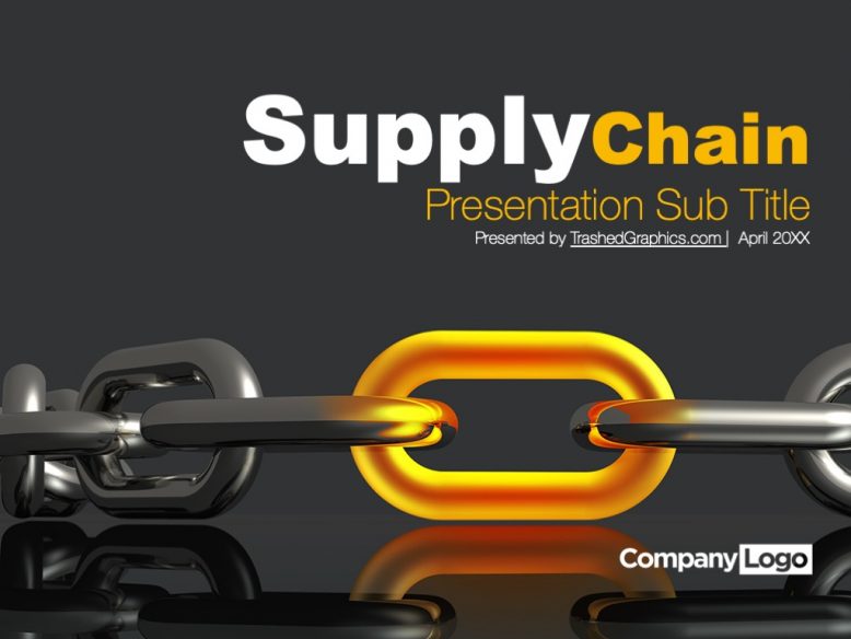
This is a six-page slide deck (the same structure that I used for both my Cloud Computing PPT and my brain PowerPoint template), featuring all the basic elements you’ll need to create a memorable presentation. The cover slide features a simple 3d rendering of two chain links connected by a single glowing-hot link. It’s a metaphor of course: think of that glowing chain-link as the critical element in a supply chain. Without it, you can’t connect everything together. Brilliant, eh?
The rest of this supply chain management PowerPoint template consists of the following pages:
- Content slide
- Data slide with a chart and blocks of text
- Section break page (dark version)
- Section break page (light version)
- Table slide
You certainly don’t have to use all of the pages in this slide deck for your presentation. I realize that some of the graphics are extremely bold and heavy,. If that’s a bit too much for your taste, don’t worry. I won’t be offended. If you’ve been a follower of my presentation templates for a while now, you’ll know that I got a very heavy visual design style indeed.
What version of PowerPoint is this template compatible with?
This supplier chain management PPT was created entirely in PowerPoint version 16.16.22. I believe that to be the 2016 version of PowerPoint, but no matter. All current versions of PowerPoint (going all the way back to the 2008 version) will open this PPT just fine.
Keep in mind that I’m not using any special effects or fancy coding anywhere in this template. It’s about as basic as it gets, with simple graphics and basic text. There’s nothing in it that will make it incompatible with any other version of PowerPoint.
What fonts are used?
Just like all my recent PowerPoint templates (even my highly-stylized Purdue PowerPoint template), I’ve tried to stick to Arial as much as possible – mostly because it’s a font that everybody has. It’s not my ideal choice, but the beauty of it is that it just works and it’s the most compatible for most everybody. Nothing grinds my gears more than downloading a template only to realize that I need to buy very expensive fonts in order to get it look like it was as advertised.
I also used Helvetica in certain places (such as the main body text) simply due to its light weight and clean style. I realize that not everybody has Helvetica installed on their computer, but it’s still a fairly common font that isn’t too difficult to get if you really want it. If you’re not willing to use it (or you simply don’t like it), you can very easily switch it out to Arial or anything else.
One other thing to note about fonts. “Supply chain management” is a fairly dry topic (my condolences if that’s your job), so it wouldn’t be good to go all crazy on the fonts anyway. Remember: focus on slide deck content – and less about the visuals. Don’t worry about the font so much and just make sure you focus on delivering great information.
How easy is it to change the colors?
It’s not all that difficult actually. The chain renderings themselves are grayscale, except for the image on the cover slide (which has that glowing orange chain-link). A majority of the color in this template was created with fully-editable PowerPoint elements such as text and basic shapes.
If you’re really good with Photoshop (or any other graphics editing program) you can change the color of the chain-link to pretty much anything you want. Then, make sure you go back into the rest of the template and change out all of the other elements to match that color as closely as possible. Consistency is important, and it will tell your audience that you care about the details.
But again – a supplier chain management PPT should be about the data and not the graphics. Something I had to keep reminding myself as I was creating this template…
Are the master slides easy to edit?
Yes! Personally, I’m not a very big fan of creating complex master slides. I prefer to keep those as simple (and default) as possible, since added complexity will increase the chances of making this template not suitable for a wider number of people.
In other words – this is a supply chain PowerPoint template for the masses. If you’re familiar and comfortable working with default PowerPoint master slides, you’ll be perfectly at home with this slide deck.
For those of you who are not familiar with master slides (and how powerful they can be), do do be sure to check out this tutorial by GCFGlobal.
What’s the file size?
This fully editable six-page PowerPoint template comes in at a measly 1.48 MB. Some might consider that to be at the higher end of the spectrum, but remember: this is a graphics-rich slide deck, and you have to give up file size efficiency in order to get something looks great. Sorry. That’s just the way it is.
However, those of you who are not willing to accept any graphically-rich slide deck over 300 kB, be sure to check out the slide deck I created using nothing but PowerPoint 3D shapes.


No Responses Yet