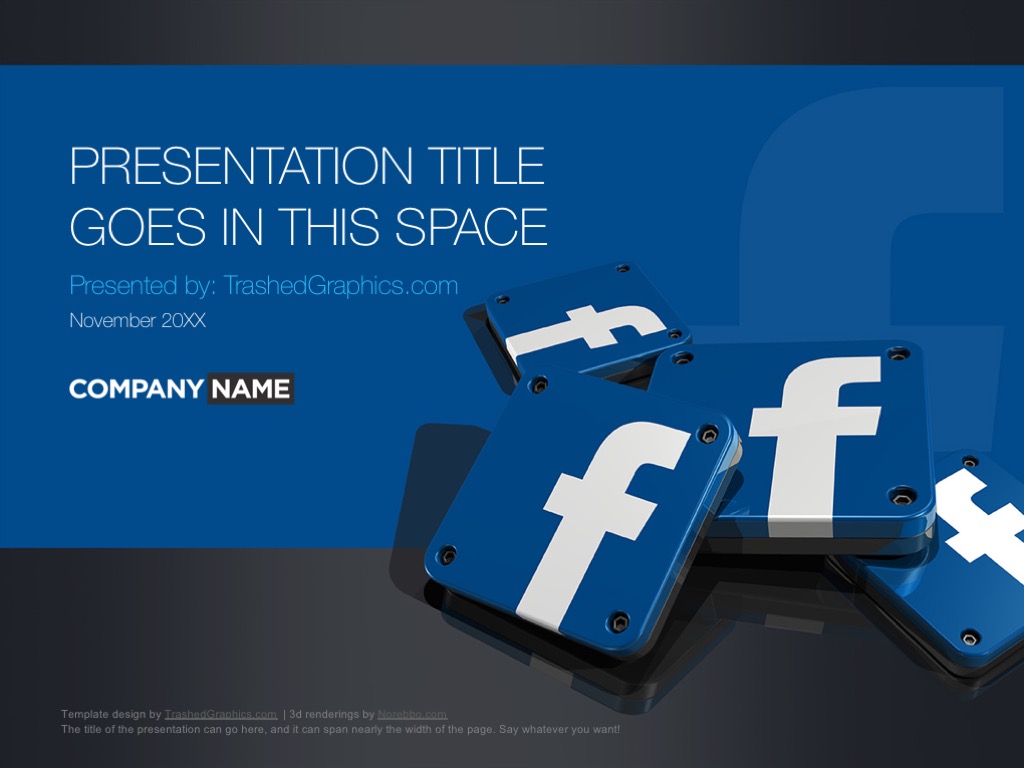
Now that I’ve done a series of social media themed PowerPoint templates (Instagram, LinkedIn, SnapChat, and Facebook), I’m just sitting around twiddling my thumbs trying to think of others to create. I don’t know why I didn’t think of it before, but somehow I completely forgot about Twitter! I fully admit that I may not be the sharpest knife in the drawer, but forgetting about a major social media network like that is kind of embarrassing for a guy who makes a living online. So without further adeu, here are two fresh Twitter PPT slide decks that I whipped up just this week.
Four page PowerPoint template with 3D Twitter app icons
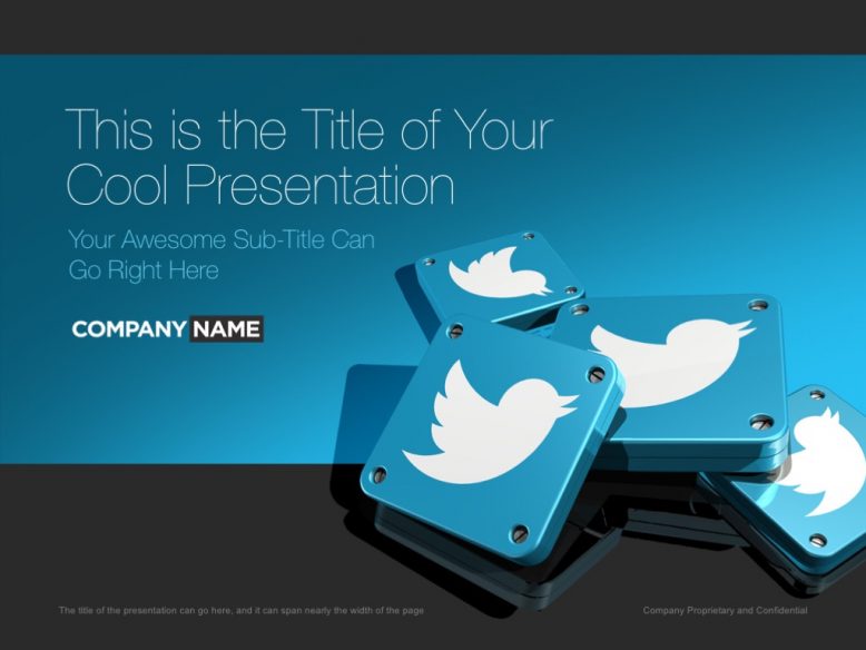
Those of you familiar with some of my other social media presentation templates will recognize the layout of this one. The cover slide features a pile of 3-D Twitter app icons arranged in a not-so-organized matter over a dark reflective surface. And if you want my opinion, I think the color of the Twitter blue goes quite well against the dark gray background. It creates a lot of really nice contrast which is going to impress your audience from the very first slide. And trust me – having the full audience at your attention right from the beginning is always the best way to start. Starting with a bland looking cover slide is never a good idea!
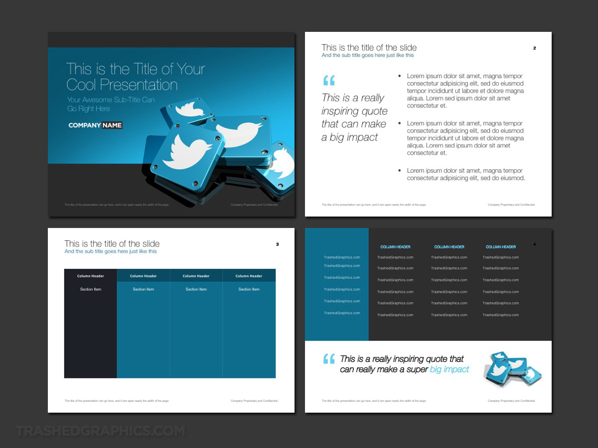
Fully editable Microsoft PowerPoint presentation template. Includes cover, text, and table pages. Twitter theme with 3d app icons.
The interior slides are similar to my other social media templates as well. However, being that this is a full-blown Twitter PPT theme, of course I switched it up so that the Twitter brand is prominent. This was achieved by placing another pile of 3-D Twitter app icons in the lower right hand corner (similar to what was on the cover slide). Note that this isn’t the exact same 3-D rendering that I used on the front cover of this template, but it’s similar enough to carry the theme throughout the entire slide deck.
3 page flat design Twitter PPT theme
As much as I like creating 3-D renderings, I do realize that not everybody likes that photo realistic style of illustration in their PowerPoint slides. Therefore, I wanted to create another version of the Twitter PPT that I created above which wasn’t so dependent on heavy illustrations. What better way to tone things down a bit then to go with a flat design? Those of you familiar with my work know that I did a medical PowerPoint template very similar to this:
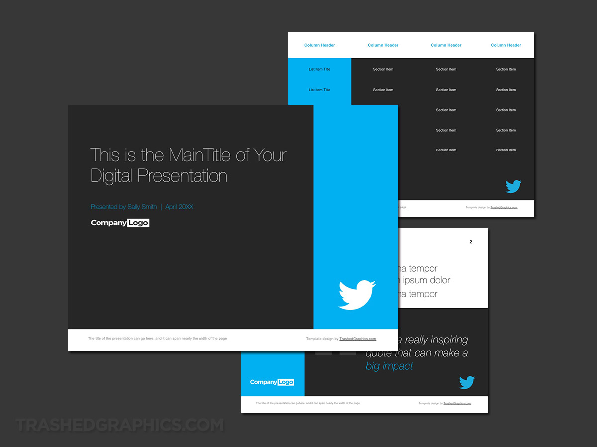
Fully editable Microsoft PowerPoint presentation template. Includes cover, text, and table pages. Flat design Twitter theme.
As far as I’m concerned, flat design and PowerPoint templates go together like peanut butter and jelly. And this is mostly because It’s very easy to create a majority of the template from directly within PowerPoint using the built-in shapes tools. PowerPoint has never been a very good tool for creating interesting graphics, but it excels at allowing the ability to create some really nice looking grids in cubes which are the backbone of flat design.
For those of you who are interested, I did create a full PPT theme once using nothing but PowerPoint shapes. It was a fun experiment, but I much prefer using imported illustrations and photography in my presentation slides.
Anyway, I chose to go with an all gray backdrop for this particular Twitter PPT theme, simply because of what I’ve mentioned earlier. The Twitter blue and a dark gray backdrop go extremely well together and it helps to emphasize the Twitter brand. Of course I could’ve gone with it all blue design, but I fear that would have been overkill and too distracting.
I’ve created enough slide decks over the years to know that it is possible to go overboard with the design of a presentation template. Remember – the primary purpose of your slide deck should be to contain and showcase your information. If your audience is too distracted by flashy graphics and animation, it’s going to be very difficult to gain any credibility.
A few more words about the color palette of these Twitter slide decks
More than just blindly following the color palette of the Twitter brand, the blue and gray colors in both of these templates serve a greater purpose. You see, I suspect that users of this Twitter PPT are going to inevitably include screenshots of the default Twitter app into their presentation. As a matter of fact, I suspect that it’s going to happen quite a bit. But you know me – I’m always thinking ahead and trying to ensure that the designs I create look great in nearly any situation.
What I’m trying to say here is that the muted blue and gray color palette in both of these themes are a perfect container for screenshots of the official Twitter app. So feel free to go nuts and insert as many screenshots of the Twitter app as you need, because it’s going to look great integrated into both of these themes.
What are some of the things you can use these Twitter PPT themes for?
My primary reason for creating social media slide decks such as this varies. For example, my Instagram PowerPoint theme was built specifically for social marketers who manage the social media accounts for other brands. It’s primary purpose was to be used as the foundation of their sales deck which they could use to pitch to potential clients about their services.
The thing is, Twitter isn’t as powerful of a brand as Instagram is. Therefore, I’m not so sure that this particular Twitter PPT would work as a generic social media slide deck for social media brand managers. However, that’s not to say that it doesn’t have a ton of potential for other uses.
First of all, I built this PowerPoint template with flexibility in mind so that it can be stripped down and rearranged for nearly any purpose. I tend to think that the blue and gray color scheme of both templates would work well for a variety of different industries – so feel free to strip out the Twitter logos and add in your own.
Another idea is to simply extract the Twitter logos from this template (which is easy to do ) and use them in your own (completely different) slide deck. Better yet, combine the pages of this Twitter PPT with one or more of my other social media PowerPoint templates for one heck of a powerful social themed presentation. Just as a reminder, I’ve already (hilariously enough) created a Google Plus PPT theme – so I’m totally willing to do a template for any brand out there!


No Responses Yet